 Click to download full version
I'm continuing to restore and print film posters. And this film is one of my favorites.
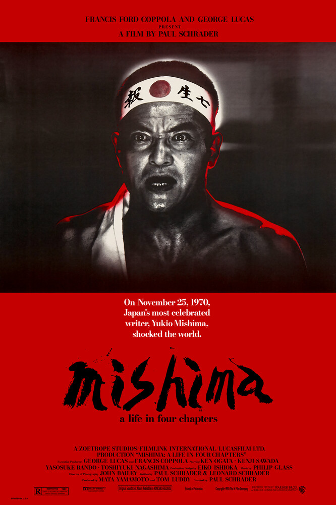
The restoration process:
- I found the best scan of the original poster I could, using Google Images.
- I leveled out the image a bit, to make up for a bit of dulling in the scan.
- I used Upscayl (using the UltraSharp model) to bring up
the resolution 4 times. I continue to be impressed with this tool, and it did
a very good job of adding some detail to the photo and keeping it sharp.
- I replaced the red background with a new layer, and replaced the text on top
of that with manual font-text. I also found high resolution logos and added those at
the bottom.
- I spent quite a bit of time re-justifying the text a bit, as I felt the
spacing was not ideal in the original (YMMV).
- I also spent a good bit of time removing white speckles which the upscaling
process added to the photo.
- I worked on the mishima painted title separately. I converted it to greyscale,
resized it up with a Bicubic algorithm, used a combination of a surface blur, motion blur,
and levelling to make the edges uniform straight and sharp, patched a few
sections manually, and finally resized it down again and made it transparent
to move it back to the main poster.
I find this process can work well to upscale and sharpen monochromatic image
sections.
- The upscaling process made the bandana on Ken Ogata's head flat, as well as
the red glow around him. I decided to lean into this effect and did some work to flatten these
bits further. I can't tell from posters I find online if this effect is present
in actual prints.
- I decided to scale the bottom text down, and scale the mishima title up (using
the higher res version from above). I figure that painted title deserves special
treatment in the composition.
I hired a professional printing studio to print and frame the image at an A0(!)
size, and I am extremely pleased with the result. The text is perfectly sharp.
If you come up really close to it, then there are parts of Ken
that are slightly out of focus/not sharp, but there is no pixelation, and the details on
his face did come
out very sharp overall. The crispness of Ken's glow and bandana has also worked
very well to contrast the photo. I used the red from Ken's glow for the background,
and it is much more violent then I expected; delicious.
Learning from my experience in printing the 2001 poster, I
raised the mid-point of the photo in the hope that that one can make out some of the
background details. This shows up quite brightly on my monitor (which
is not of graphic design grade) but I'm very pleased with the print -
the background details show up just slightly under normal indoor lighting, which is
perfect.
It took me a good day's work (which is cool, I find this process relaxing)
and I have to say I couldn't be much happier with the result. :)